Cringe-Worthy Blogging Trends of the Past that WILL NEVER Work Now

Past blogging trends are building blocks of what websites are nowadays. Who would ever know that the internet would be such an integral part of our daily lives? The internet has changed so much, so fast in the past few decades that there are so many design trends that the younger generation of internet users never knew existed. Design trends that older generations of internet users wish to forget.
Designers were pretty much experimental when websites were starting to get popular. Any form of movement or color in a website is an indication of how great the world wide web was and could be. Generally, the ’90s and the early 2000s were very cringe-worthy periods in terms of styles and trends. This was also very much evident in the way websites were designed during the time.
Here are a few cringe-worthy past blogging trends that will never be popular again:
HTML Marquee Tags (sometimes with GLITTERS)
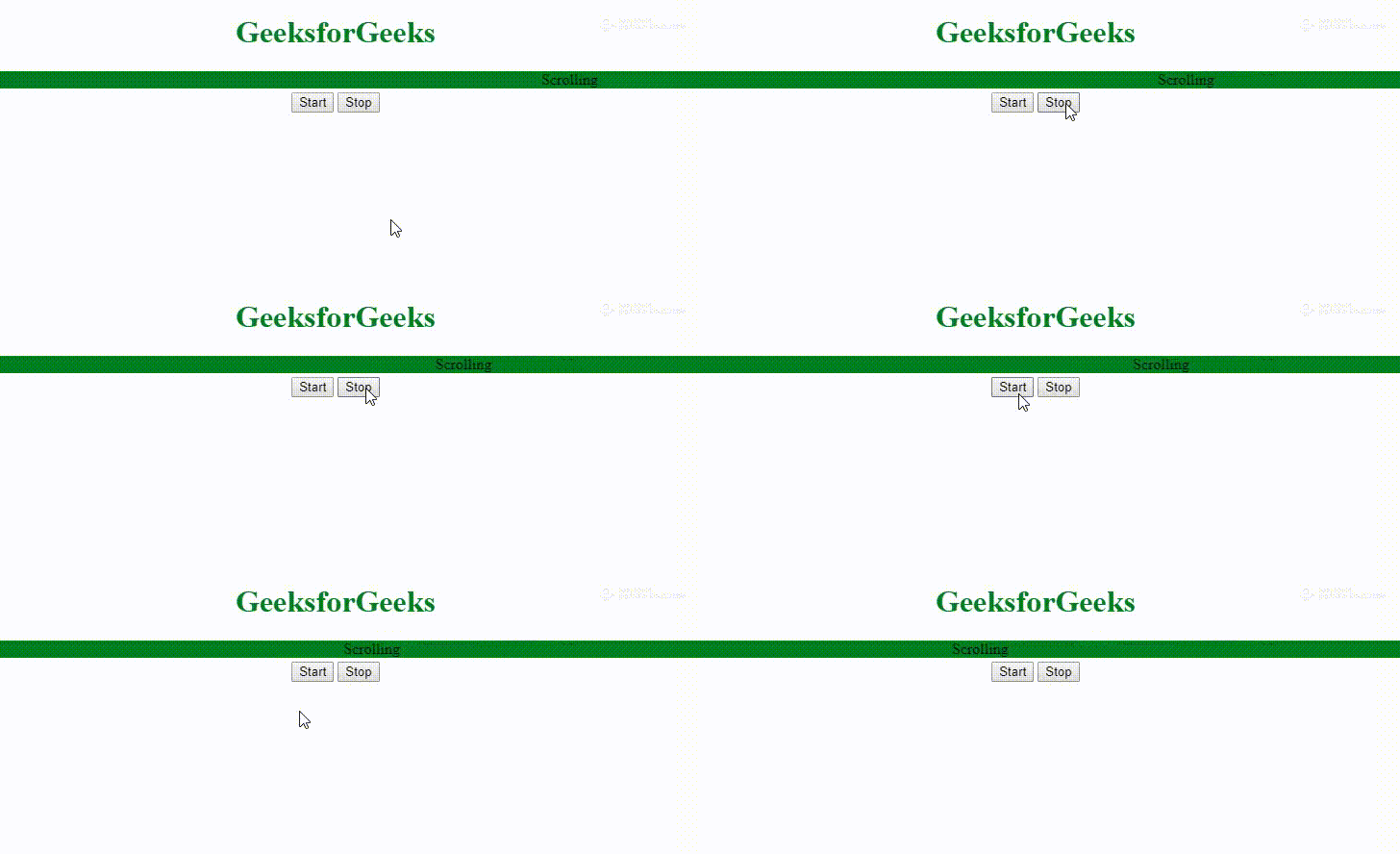
Movement in a website was phenomenal at the time – blinking, rolling, and rotating. The marquee tag (from HTML) was commonly used in many websites. Text could roll from left to right, right to left, up or down. They could even be designed to look like they are bouncing. At first it was cool, but the more advanced web design became, the more we all realize how cheesy it truly was. Imagine a moving marquee on a website, designed with WordArt and glitters. Yikes!

It’s so cringe-y that the marquee tag on HTML is already obsolete.
Rainbow backgrounds….in neon
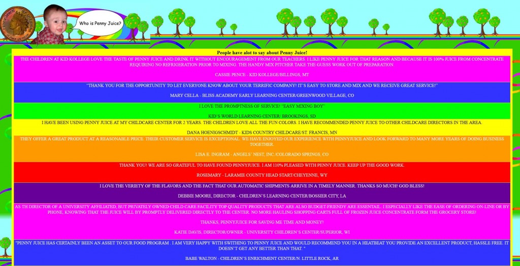
The trends for rainbows will exist forever. Why else would unicorn-themed everything be so on-trend right now? But, there was a time in the late ’90s and early 2000s where we thought using bright rainbowed backgrounds were cool. To the point that the contrasts are so bright they almost looked neon. Even worse was using inappropriate type face style, color, and size to match.
Let’s take a look at this Penny Juice website, for instance. Each content or title is presented in a band of color, alternately presented. We have neon purple, bright royal blue, followed by neon green, yellow, and orange. These are all bright colors against an equally colorful background. It might have worked in the past, but this is definitely a no-no in today’s website color theory. Seriously, a lavander font color on a neon purple background? Eye-strain much!

Laid out like newspaper classified ads
Sometimes we wonder when the “right” web layout came about in the past. There are a lot of pages and blogs in the past that were laid out like newspaper classified ads, but worse. In our example below, there is an explosion of ads, and not a single page space gone to waste.

This website was created back in the late 1990s, and is still online today. They must’ve done something right to exist for that long. Let’s all be forgiving, UX/UI design was just a developing concept at the time!
Animated Backgrounds
Animation in any website makes it more interactive for users. But, there must be a limit to HOW MUCH animation you could put in. Let us enumerate what is cringe-y about this website, and why this kind of design will not be as popular today as it was when it first went online. First, the object on the background is replicated countless of times and all of it are rotating at once. Second, all the 3D figures on the left AND right sides of the websites are either moving or rotating. Last, the large 3D image presented at the center of the website is rotating as well. So basically, yes, everything is moving.

Before you get judgemental, this website was created to advertise a 3D graphing software.
Clip-art and Icons are past blogging trends
Websites and blogs from the late 1990s and early 200s used a lot of web icons and cliparts. The concept of cute must have been different back then. For instance, this website used a graphic of a taco to present its categories. However, the website is not a Mexican restaurant, an online cookbook, or anything even remotely related to a taco.

Technical Advisors Custom solutions for all Occasions – T. A. C. O. Get it? Sometimes, the pun can easily be lost on us.
What…what eye-strain?
There is a lot happening to our example here. The background is created from the page’s logo, replicated numerous times. This is colored a bright neon blue in contrast to a more royal blue. All the fonts are either yellow or white.

At the time, a user will know if a text is “clickable” if it is colored either neon yellow or neon blue. Other times, it is bright red. What we mean about “clickable” is that it will direct a user to a different part of a website via hyperlinks. Maybe because the concept was to make it visible to the readers. This was the time when buttons were not so easy to create and hyperlinks were used to loop together different pages to create a website. It was pretty much a website standard, back then.
Also read: Why You Should Write Guides & How-Tos
Civil Engineer by profession, Writer by passion. Serving readers since 2014 on different niches like Science, Current Events, Tech, and Travel.

