How To Make Your WordPress Site Mobile Friendly In 60 Seconds
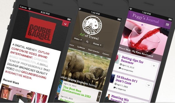
Over the past several years, smartphones have revolutionized how we connect to the internet, and interact with others around the world. According to Pew Research Center, 34 percent of adults own a tablet, and 56 percent of adults own a smartphone. Chances are, some of your readers are consuming your content using one of the two devices.
If you have yet to make your WordPress site mobile friendly, here are a few problems:
- Longer load times. Not everyone is able to enjoy 4G speeds, and even on 3G, a typical web page can far exceed the average 7.25 second load time for web users.
- Poor user experience. Your blog may look great on a desktop or laptop, but when you shrink it down to a screen as small as 3.5-inches, it becomes a jumbled mess.
- Adding to your reader’s phone bill. Okay, maybe it’s not that bad, but a lot of smartphone users are on a capped data plan. If a blog post requires a few megabytes of information to be loaded, that’s data use you could have easily avoided.
To make your WordPress site mobile friendly, many think they have to go find a theme, do all this coding, or hire someone to do it for them. That’s completely fine, and there are many exceptional examples out there. However, you don’t have to do that, let alone spend any money.
After testing several different plugins, I’ve found WPtouch to be one of the easiest to use, and most reliable. Since it’s a plugin, you can get up and running in about 60 seconds. To get started, log-in to your WordPress dashboard, and select “Add New” under “Plugins”.
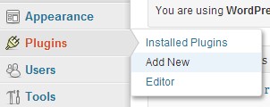
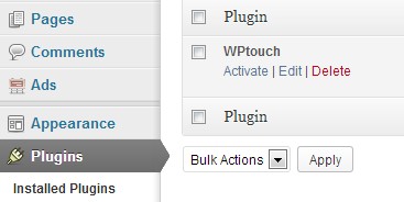
From there, do a search for “WPtouch”, and select “Install Now”. Once you’ve installed, make sure to go to “Installed Plugins”, and activate it.
And that’s it. You’ve successfully made your WordPress site mobile friendly! Now, you could just leave it there, but it’s worth spending a few more minutes to customize how your site will appear to readers. Scroll over “Settings” in your dashboard, and select “WPtouch” from the options.
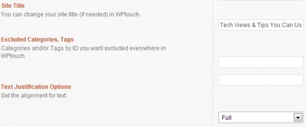
Since this will be appearing on smaller mobile screens, it may be a good idea to shorten your site title. Also, you can exclude specific categories or tags from appearing. Font justification should be left at full.
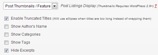
When it comes to “Post Listings Options”, here are what my settings currently look like:

WPtouch automatically pulls in your default footer message which in most cases can be left alone. “Advanced Options” are mostly a matter of preference, and are pretty straightforward. Since WPtouch supports all popular devices, “Custom User-Agents” can be left alone as well.
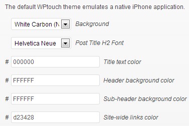
“Style & Color Options” is where you’ll be doing most of your tweaking, and it might be handy to have your phone right beside you to test any changes. Currently, there are 14 different backgrounds to choose from, and seven different title fonts. You can also customize the color of things such as your title text or header background.
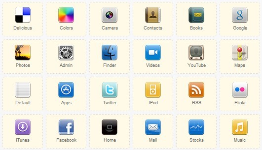
One nice added feature is the ability to upload custom icons. There are already a bunch uploaded, but if you have a square logo for example, you can upload it as an icon. Just make sure to resize it to 60 by 60 pixels.
Don’t forget to save any changes by clicking “Save Options” at the very left bottom. Once you’ve made all the necessary changes, your blog posts should look something like this:

For even more customization options and exclusive themes, WPtouch offers a paid version which starts at $59 for one site. As you can see, to make your WordPress site mobile friendly requires very little time at all. Best of all, you can now deliver a solid viewing experience to mobile readers without them getting frustrated, and moving on to something else.
fantastic post and believe me save my big time to create friendly mobile website blog i really appricated your work and know about the WPtouch its pretty good plugin install with easy step…
Yes, Wptouch is great to use and make site mobile compatible, but it lack responsiveness in some cases and also can’t mobilize the admin area. I would prefer a more targeted service for creating wordpress mobile site like http://itsmob.com ors omething like theme.
i read your comment and think that you are true , this plugin is as good for all themes ….i applied it on my site http://www.techfree4u.com ..would you like to suggest any other thing to make the mobile version of my site…thank you
great article , thanks you
Hello there:
great article….I installed the plugin and still my page is not loading…. this page was grea before but now it is not showing up in mobile….can you help me….
Cheers,
It is only showing my home page…sadly, this is not adequate. Is there a setting I am missing?
WHOA!!! I figured it out! It is wonderful, thanks again.
ello there:
great article….I installed the plugin and still my page is not loading…
????? ???? ??? ????? ?? ?? ??? ????? ?????
To tell the truth, I didn’t use to care about if my sites are mobile ready or not in the past. Half a year ago I started a new review website and I did my best to make it full responsive and mobile friendly. It was a good decision! 4 out of 10 purchases are made on mobile. I recommend everybody to make a site mobile ready not just for better user experience, but for more income as well.
To make your WordPress site mobile friendly, many think they have to go find a theme, do all this coding, or hire someone to do it for them. That’s completely fine, and there are many exceptional examples out there. However, you don’t have to do that, let alone spend any money.
WP touch is a good plugin to use when creating mobile versions of wordpress sites.It also comes with a feature rich pro version, but i believe the free version would suffice for a WordPress mobile site anyday.Be careful of WordPress Mobile pack due to its installation errors, you should take caution after installation to ensure it doesn’t muddle your content.
great article , thanks so much
ok ! I figured it out! It is wonderful, thanks again.
I spent 2 hours trying to do this myself. Thank you so much for this post, it has saved me even more time. I’m a happy chap!