3 Incredible Landing Pages And What We Can Learn From Them

Wish your landing pages would convert better? Read below to learn from the best!
There is so much to think about when it comes to building up a successful website: You have your web design. You have SEO to consider. You have to make sure social media integration is in place. Did you make sure you have all the best plugins installed so your website runs tip-top? And, of course, your writing needs to be engaging, actionable and top shelf.
It’s enough to to make your head spin. One thing that may not have made your to-do list is spending time on your landing page design. Conversion Rate Optimization is an often overlooked aspect of building up a successful website, and you should not underestimate its importance.
What do you consider a conversion anyway? It could be anything. Anything that you would define as a successful visit can be called a conversion.
A few examples:
- Newsletter signups
- Contact form submissions
- Product Purchases
- Downloading Whitepapers
To optimize your landing page is to align the user experience around what it is that you want them to do. Get rid of the filler and make sure your landing page web design is guiding people along to the next steps in your conversion funnel.
Below are three excellent landing pages and my commentary on what makes them great.
1- Neil Patel – Keep It Simple Silly

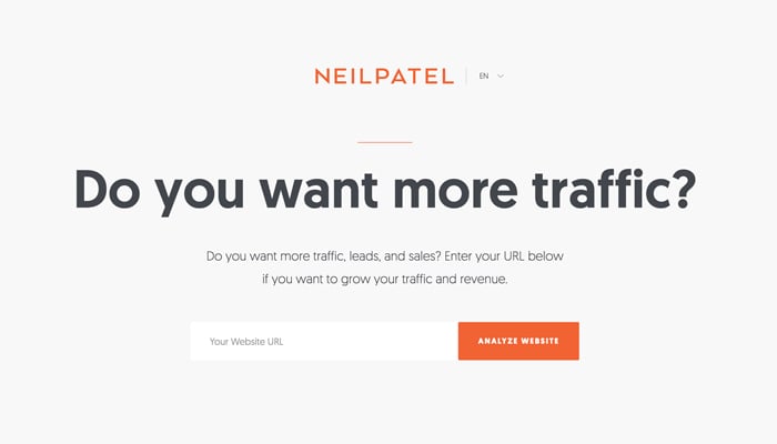
Neil Patel, internet marketing guru and founder of Kiss Metrics, has a brilliantly simple landing page that is laser-focused around a single goal.
What is a conversion for Neil?
He wants you to hire his agency to grow your business.
How does his landing page accomplish this?
This landing page addresses a problem that his target audience has of not having enough traffic. The main text speaks directly to this in very plain English:
“Do you want more traffic?”
He provides an input box just under the main text for users to enter their domain name and press a button that says “Analyze Website.”
The website will then churn and display text snippets showing “opportunities” his website analyzer is finding. Eventually, the process ends leaving the user with teaser text stating how many “Marketing Opportunities” the software found. You then have a contact form to request for someone on his team speak to you about the next steps.
How does the landing page design support this goal?
The design of the landing page itself “keeps it simple silly.” It is a no-frills layout with no navigation, no distractions, simple headline text and a box for you to start the ride down his funnel.
2- Grammarly – Great, Simplified Messaging

Grammarly is an online grammar checking, spell checking, and plagiarism detection platform.
What is a conversion for Grammarly?
Grammarly’s landing page wants a user to install their browser extension.
How does their landing page accomplish this?
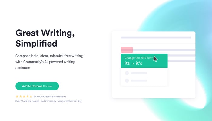
The landing page uses straightforward text to help draw a user in with the statement:
“Great Writing, Simplified”
There is a very well done animation that shows you how the extension works and a giant button to the left with the text “Add to Chrome for Free.” The text in this button is auto-detecting your browser and changes accordingly.
When a user clicks the button, they are led to the extension download page where they can then install the extension.
How does the landing page design support this goal?
The design of this page utilizes many elements all supporting their “Add to Browser” button. They use simple copy and have great visuals via an animation that displays the tool in use across various popular websites such as Facebook and Google Docs. They also add a social proof element showing ratings and usage stats directly below the button. All of this is wrapped up in a landing page with no navigation and only one thing to do on the page.
3- Ahref – Why They Get Their Customers

Ahref’s is an all in one SEO solution that allows you to audit your website, explore competitors, research keywords and analyze backlinks.
What is a conversion for Ahref?
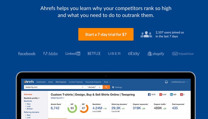
Ahref’s wants you to sign up for a seven day trial for $7.
How does their landing page accomplish this?
The landing page starts with text that speaks directly to their target user:
“Tools to grow your search traffic, research your competitors and monitor your niche.”
This statement is a universal need for any SEO worth their salt.
Clicking the large orange button opens up a lightbox containing their form that allows a user to pick between their Light or Standard packages, enter their email address, check their terms and conditions and click a “continue” button bringing them to the next step in their checkout process.
How does the landing page design support this goal?
Blue backgrounds with Orange call-to-action elements are a staple. You pretty much can’t go wrong with these opposing colors in a landing page design. The lone orange button stands in stark contrast to the rest of the page making it very obvious what you should do next if you want to move forward with their signup.
Social proof displayed via the logos of some of the biggest brands on earth solidifies the reputability of their product. A small stat section showing how many people have signed up for the trial in the last seven days displays their popularity helping end users feel comfortable.
Rounding out the design is a screen grab of the actual software that would appeal to any marketer looking for a tool like theirs. The screenshot proudly displays a very modern and clean user interface.
A+ landing page design for sure (It worked on me).
The Takeaways
The main takeaways after diving deep into these fantastic landing page examples are as follows:
- Use simple, direct and to-the-point headlines
- Have obvious conversion mechanisms with only one thing for users to do
- Produce easy to understand graphics that support the cause
- Have a simple color scheme with high contrast buttons or forms
- Removing your navigation “could” aid in keeping visitors focused on the goal
Drawing inspiration from these and other high profile landing pages is a great way to learn what you could do to make your website work better for you.
What landing pages inspire you?
Author Info:
Rodney Warner heads the team at Connective Web Design and is also a musician, outdoor enthusiast, and ice cream connoisseur.

