Improve Your Blog: Usability
How easy is your blog to use? Can the visitor move around quickly and easily between posts? Between categories, archives, and other multi-post pages with more than one web page? Can they immediately identify the About, Contact, and other key Pages which will give them more information about you and the blog?
Are the blog posts clearly identifiable from other content on the blog, such as graphics and ads. Or do the graphics and ads interfere with the post content?
When viewing multi-post pageviews, is each post title clearly defined, separated from the post above and below it? Is it obvious it is clickable, taking the visitor to the post?
Are the categories clearly defined so the visitor sees them and knows there is more content that might hold the answer if this post doesn’t? Are there only a few, specific categories, or dozens? Do they complement each other, or are each disparately different?
Is there a list of recent and/or related posts that will help them find more sources for the information they need?
As part of this ongoing series on improving your blog tips, I ask each of my clients these same questions if they already have an established website or blog. At the end of the day, the real score card is how usable your site is, not just how well you play the Google Game.
How Do You Use Blogs?
How do you use and read blogs? Do you read other blogs, or just your own or a few favorites? You’d be surprised at the answer. I always am.
Many bloggers read blogs through their feeds, rarely visiting the sites except to comment. Some read other blogs beyond their core favorites only occasionally. They may skim the front page if they visit the site, but few spend time really digging into blogs like they did in their early days when all of this was new and exciting.
Few people still understand what feeds are or how to use them, so you better go back to learning how people use websites and blogs in order to get a real perspective on the average user’s experience.
So how do you use blogs? When you arrive, what’s the first thing you look for beyond the answer to your question? Do you look for post categories to get an idea of what they cover? Do you look for an About page to find our more about the author(s)? Or do you just look at the pictures? :D
As you move through the blog, what elements do you look for to help you move? Next and previous links? Tags? Categories? What compels you to dig deeper into a blog for more information?
Then apply these usability factors to your own blog.
What to Call What?
As you study blogs, you’ll see consistency in links and names of things.
The “About” Page is usually called “About” not “Things You Need To Know About Us”, “Who Am I” or “Want More Info”.
The “Contact” Page is called “Contact” not “Want to Find Us” or “Give Us a Call”.
The post categories are labeled “Categories” not “What We Write About” or “What’s Online”.
A schedule of events is called a “Schedule” or “Events”, though sometimes “Calendar”.
The legal policies pages are called “Policies” or specifically labeled as Copyright and Comment Policies, along with access, accessibility, and other legal policies your blog may need. Most are usually sub-Pages of “Policies” or “Legal”.
Next and Previous Posts are labeled “Next Posts” or “Previous Entries”, both recognizable formats.
Post titles are clickable, even on single post pageviews. There’s a byline, which often links to posts by that author or more information about the author. The comment form features a name, email, and URL in addition to the comment form. There is a post meta data section, a section where more information on the post is found such as the author, categories, tags, date, and other details.
These things are normal on most blogs. Labeling your About, Contact, and other Pages, as well as your post categories, is not the time to get creative. Keep them clearly labeled in the traditional format to make it easy for people to the typical information they hunt for.
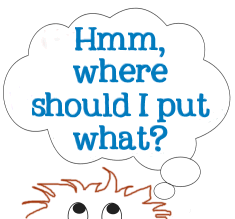
Where To Put What Information?
But what about the rest of the information? Which content do you put on a post and which do you put on a Page?
 In general, I explain to my clients that permanent information that visitors want consistently needs to be put on Pages, the non-chronological, pseudo-static web pages of your blog. This is typically the information about the blog, company, and authors, products, services, contact information, events – static billboard and business card information.
The blog posts are the chronologically flowing content of your blog. Think of them as the “latest news” sections with the first post on multi-post pageviews as your most recent news item. Announcements of sales, promotions, events, and other timely information can be published on posts as you want the most recent information and news at the top of the list.
In between timely information, that’s where the real content goes, information about who you are, how you work, what you are working on, and tips, advice, and the information readers need to know about the company and its business.
How Many Clicks Does It Take?
How many clicks does it take between the wanted information and the information? Less is more, right?
As web designers are thinking through usability issues in their designs and making dramatic improvements as the knowledge and technology improves, one aspect of usability, or the lack thereof, happens within the post content, the area of the web design the designer has little or no control over: the links.
If you put a link in your blog post, what happens next? Does the link take the user to another post on your blog or off your blog? What happens next? Do they have to click more to get to the information you just recommended by link? Or does the click give the visitor more than they might want, like a click that loads video or music without warning, or redirects to another page, or pops up ads, or may load software without warning?

Instead of linking to a Page, some bloggers link to a category of posts to represent a collection of information on a subject. This is great, if the visitor is looking for a body of work on the subject, but not if they are looking for specific information on the topic.
Some WordPress Plugin authors create a category rather than a specific Page for their WordPress Plugins. When they talk about the Plugin, the link takes you to the category with blog posts about the Plugin. The reader has to scan and click through posts to find information on the latest version, or a fix they need for an older version.
Why bother? Why not create a single Page for the Plugin and stop the clicking and hunting. Authors can still publish posts about the Plugin, but they all revolve around a central information-packed Page rather than a category collection of posts. Get the information to them as fast and easy as possible – with one click.
If the outgoing link forces opens a new tab or window, you’ve increased the click count for the reader. If they are using a web browser with tabs, the tab probably opened in the background. This means they have to click on the tab to see the page they just opened. Your page is still open, so they have to click back and close that, adding to the click count and time spent messing around.
If they have multiple tabs open, that clicked link may open in a tab past the end of their visible tab list. They might think, as I often do, that the click didn’t work. So they click again. Nothing. And again. Nothing. Oh, well, the link doesn’t work. Darn. That was a waste of time. Later, they find out they opened 6 pages of the same link and have to close them down. That’s a lot of clicks from one link.
There are many reasons such forced links are bad, beyond the fact that opening links in new windows or tabs is against web standards for accessibility. Stop wasting visitor’s time with too many clicks.
If an outgoing link on your blog is good enough, they’ll be back for more. It’s a strange business strategy but it works very successfully with blogs.
How Usable is Your Blog? Does Everything Work As It Should?
Really explore your blog’s usability. How easy is it to use? How easy is it to find the information the visitor is looking for? How easy is it to subscribe to the blog? How easy it is to understand what the blog is about?
Schedule frequent “blog testing” days, especially after every time you change the Theme or add a new WordPress Plugin. Validate the code to make sure everything still works. Write a post to make sure it publishes right without errors. Log out and leave a comment to make sure all the comment spam fighting tools are working right and not leaving the commenter looking at an odd screen or blank white page.
Search your blog for something hard to find. How much work does it take to find the information?
Go through your post categories to see if they are still representing the content on your blog, and click through to see what the post category pageviews look like. Can the reader move through them historically with next and previous entries links? Are they easy to find and use? How many posts are listed in the category pageviews? Too many, too few? Post summaries/excerpts or full posts? Which are easier to scan through for someone looking for content on your blog?
Check your Pages. Is your About Page up-to-date? Are your legal policies like comment, reprint, and copyright policies in place and accurate? Do they still serve your needs?
The more usable your blog is, the more enjoyable the visit someone may have on your blog. Help them relax and feel like they are “at home” on your blog. Don’t make them work too hard to get the information they need. Hand it to them with a smile and a silent but sincere “Have a nice day.”