The Making of a Brand – 5 Design Essentials for Bloggers
People love brands. A brand speaks to people on a higher emotional level than a product, service, or blog. You might think that having a brand is restricted to big businesses with huge marketing budgets and not necessarily appropriate for your blog. A brand, however, gives your blog a story and a soul! That means that not only will you be able to distinguish yourself clearly from other blogs, but also your audience will understand your vision and mission much more clearly. How you want to look, how you want to sound, and what and who you want to stand for – these are things that are deeply tied to your brand.
People want to be part of something bigger, something that speaks to them and aligns with their own values and beliefs. They want to read a blog they can identify with; brand design is the main driver to establish the trust, awareness, loyalty, and competitive advantage needed to do so. Creating a professional brand for your blog doesn’t have to be complicated, nor restricted to the likes of creative masterminds and designers.
Let’s jump into 5 easy steps to create the professional brand you’ve always dreamed of.
CREATING THE FOUNDATION
Before thinking about any kind of visual identity, you should start with the core of your blog. Defining your most important core values will help you define your brand’s voice and the design language that fits that specific vision. It’s tempting to start with choosing colors, fonts, or developing logo ideas. However, in order to do that you first need to analyze your target market.
A great way to better understand your audience is to create a persona. Building persona profiles will make it easier for you to understand and analyze your readers’ pain points, beliefs, and needs. Also, this way you can double-check your design choices against these personas and decide whether your blog design and brand speak to them.
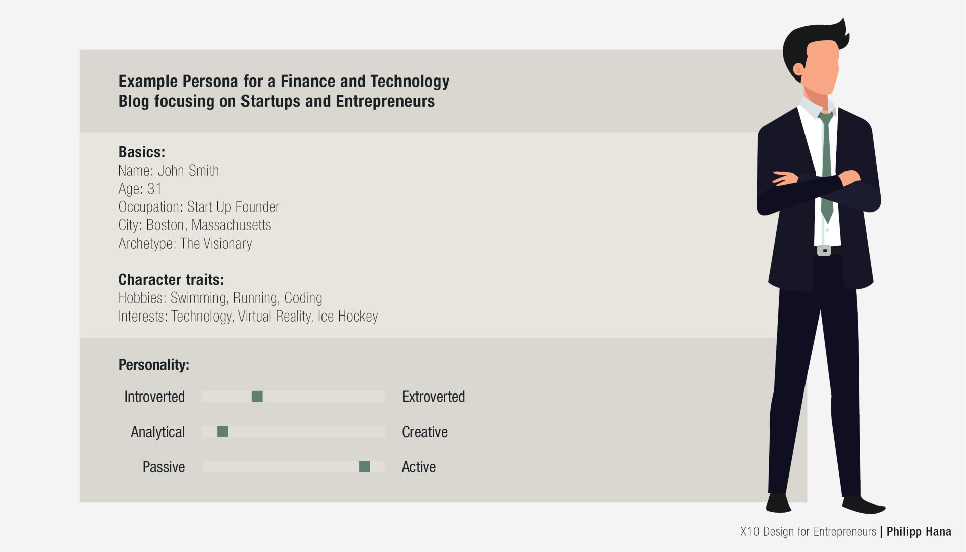
My Advice: Always design your brand with your reader in mind, not solely for yourself. Of course, you should identify with your brand! However, try to focus on your audience first: what’s appealing to your readers, how should you address them, and which colors are suitable for the industry you’re focusing on? The best and most beautiful design fails if it is presented in the wrong context or to the wrong target group.
STEP 1: GET INSPIRED FIRST
Creating a complete brand for your blog can be exhausting and overwhelming if you don’t know where to start (even if you know who your target audience is). Design agencies often start with a mood board. A mood board is like a visual mind map and canvas where you can collect anything that you find appealing or inspiring for your own brand – from specific color palettes and photographs, to beautiful fonts, interesting textures, or other blogs. The goal of a mood board is not to copy and paste from existing brands, but to get inspired to create your unique and personal design.
STEP 2: THE HEART OF YOUR BRAND – YOUR LOGO
Every great logo has a distinctive font that can stand out on its own. Especially when it comes to blogs, what could be more appealing and fitting than a beautiful font logo that is easily recognizable and can stand out on its own? Many people think logos always need a symbol or icon. A well-chosen font in your brand color or with a small tweak, however, will be just as convincing and definitely keeps it clean and professional without the hassle of creating a symbol.
My advice: Stick to an all-font logo especially if you don’t have the design background or budget to design a subtle and professional pictorial mark. Think that a font logo isn’t professional enough? Check out the blogs of Gary Vaynerchuk and Tim Ferriss, or even big outlets like Forbes or HuffPost… I think you’ll get the point.
![]()
STEP 3: THE VOICE OF YOUR BRAND – FONTS
Besides finding a great font for your logo, you also need to specify which you’ll use for your copy and headlines. Fonts give your blog a specific voice. Just like your content and your post titles, the font that you choose will decide the tonality of your complete brand. While sans-serif are perceived as modern, serif fonts are more classical and traditional. Try to focus on a maximum of two fonts for your copy and headlines. If you want to use something different for your headline, you can experiment with a more creative font. Keep in mind, however, that you need to keep it very clean and simple for your post copy to have maximum readability.
My advice: You can experiment with fonts in your logo, but your copy and informational text should be one of the classics like Arial, Times New Roman, or Helvetica. For your headlines or titles, you’ll get the cleanest and most professional result if you stick to a bigger and bolder version of your copy font. In the end, it’s all about readability.
STEP 4: THE FEELING OF YOUR BRAND – COLORS
Colors are the first thing to get noticed when someone visits your blog; they’re also the first thing that will determine the overall feeling of your brand. As with fonts, the best strategy is to focus on two main colors to keep it simple and clean – one shade as your primary color and one accent color that is used only for highlights.
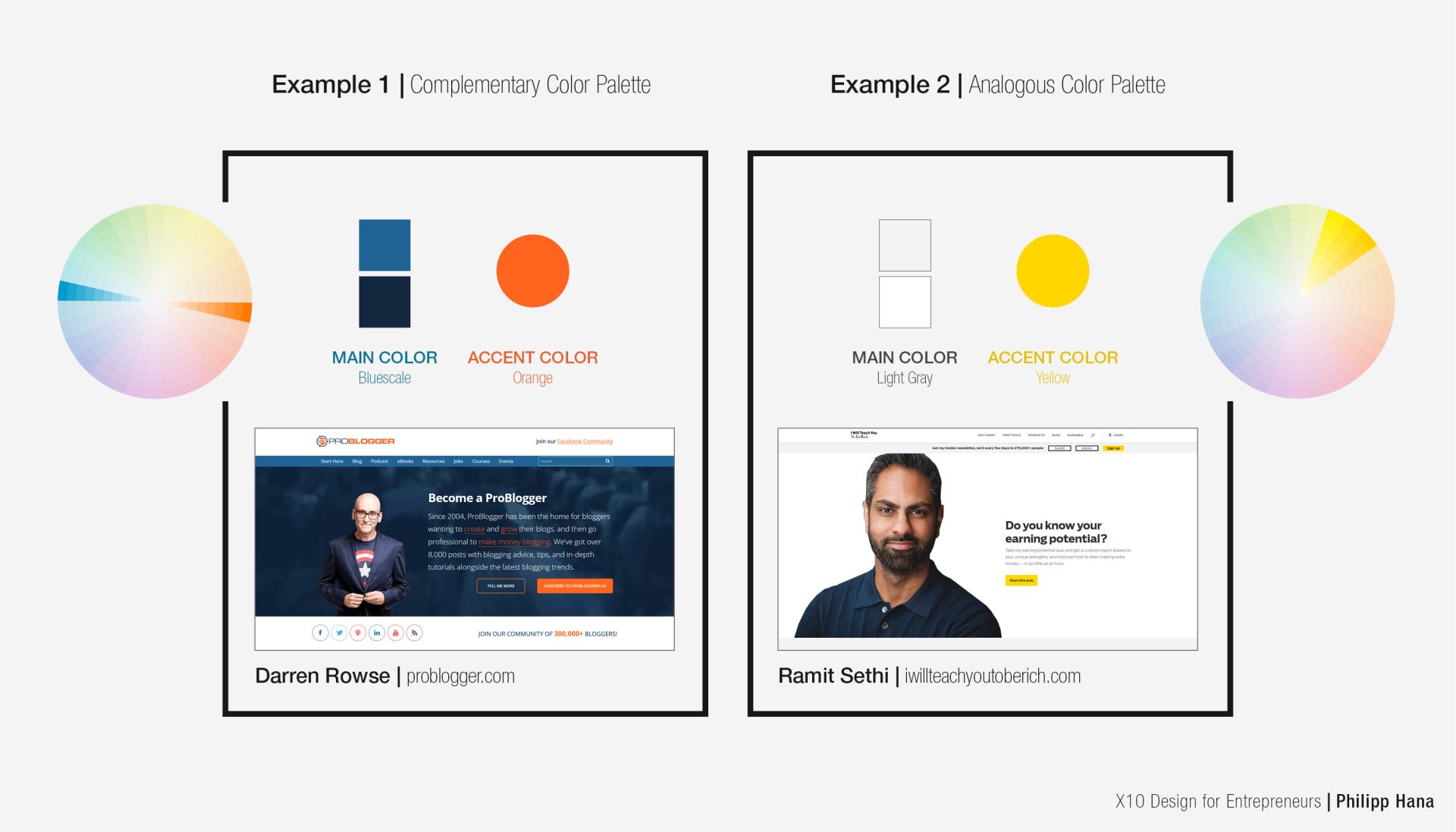
Look at other popular blogs for color inspiration and you will realize that the biggest players keep it very simple so that the main focus is on the posts. Find colors that create a distinct visual identity but do not distract too much from your content.

My advice: As a rule of thumb, the weighting of your two main colors should be around 80% for your main color (in different shades) and 20% for an accent color for specific headlines, titles, or in images.
STEP 5: THE CONNECTION WITH YOUR AUDIENCE – IMAGERY
Your images will be a key factor when designing your blog; they will define your brand just as much as the colors, fonts, or your logo – if not more. Images speak to people in a way that few other visual features can. Choose your images with great care, as people are drawn to great images and easily repelled by bad ones. You should use images to promote the content of your blog and give your brand a distinctive look. When choosing images, always make sure they fit into your brand’s voice, personality, and other images. Exaggerate and conduct a hypothetical test with every new image that you select: Would readers recognize this photo as part of your blog? If the answer is not at all, chances are that the photo won’t fit into your brand and will disrupt your consistency.
Keep in mind that images work both ways. While beautiful imagery will take your blog to the next level, bad imagery can ruin the visual identity you have carefully crafted.
My advice: Always choose high-quality photography and stay consistent. Use stock photos from affordable sites like iStock – and, if you cannot find the right photo for a post or you only have a photo in bad quality, don’t use it. Images are the store sign for your blog posts and your brand. “No images” beats “bad images” every day of the week. If the featured image is of low quality, your audience will project this onto your content.
FINALIZING YOUR BRAND
Building, refining, or retaining a professional brand appearance can be tough. However, it doesn’t have to be! By going through the above steps, you will have a great foundation to create a brand that will both stand out and stand for your specific vision. To bring it all together and to finalize your brand, you should always have three rules in mind:
- Everything about your brand communicates something. Therefore, every design decision should be consciously made with a goal in mind. If you select a certain color or highlight some part of a text, it will be noticed and attract attention. Don’t design for the sake of design itself; design to evoke emotions, provoke a discussion, or call to action.
- Always keep it clean and professional. You have heard it before: “Keep it simple and sexy” or “less is more” should always be your guideline to designing a professional brand. Check the most popular blogs and see how minimalistic some of them are in using colors, fonts, and visual effects. It doesn’t have to be black and white, but ask yourself if it really needs to be a rainbow of unicorns.
- Consistency is the most powerful design tool to increase your brand loyalty and recognition. Nothing conveys trust and quality more than professionalism and consistency. No matter the type of blog you are creating or the type of customer that you are targeting, if your brand design doesn’t convey trust and quality, you will fail to get your reader’s attention. Always keep your brand design consistent. Over time, this will boost your brand recognition as your content will always have a consistent brand voice and visual identity. Every design element above should be aligned to work together as a consistent visual identity.
Having a struggle creating the brand you’ve always wanted? Comment below and share your challenges and thoughts about the process and how it worked for you.
Author Bio:
Philipp Hana is empowering entrepreneurs and business owners worldwide to own their brand’s design process and design their marketing and branding according to their vision, instead of outsourcing it. By founding X10 Design, his goal is to inspire and educate entrepreneurs and business owners to use simple guidelines and tools to understand the fundamentals of professional design and branding.