Technorati Redesigns
Awhile ago on another blog, someone mentioned something about Technorati having some sort of “widget” that allows you to get a quick appraisal of the value of a site. I have not found that widget (and would still like to find it so if you know where to find it, drop it in comments), so I decided to go take another perusal when “Wham!” I was greeted by a complete redesign of Technorati. Amazing.
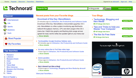
This is my logged in screenshot:

All in all a very useful redesign. What struck me the most is the immediate accessiblity of my claimed blogs on the right side. The second thing I noticed is a welcome departure from all green. While green is still the predominant color, there is now a nice balance of orange as well. /me likes.
Also front and center is a rolling update of entries from my favorite bloggers. Sort of RSS aggregator meets portal. I haven’t dived in too much yet but I’m curious how others feel about this new redesign? Does it work for you?
Update: Vincent noticed that RSS searches seem to have gone AWOL.


Given all the talk of blog architecture lately, I think the Technorati re-design is both timely and appropriate. Personally, I really like what I’ve seen so far (in limited use), and I totally agree that moving the claimed blogs to a highly accessible position was likely the most important user-centric aspect of the re-design.
I did mine iwth ‘Ping-goat’. WordPress has their own built-in ping-o-matic, but you can enter the url of your blog here and get your blog’s worth. What-ever that means.
I really like the design, and it appears they have streamlined a lot as i have actually been able to use their blog search a little better in limited use.