Responsive Design for Newbies [Infographic]

With the rise of mobile devices and people using them more and more to go online, the need for web design that works across devices arose. While the term “responsive design” wasn’t coined till May 2010 by Ethan Marcotte, the concept finds its roots in 2004, when Cameron Adams first demonstrated a site layout example that adapts to browser viewport width.
Leaving all that dry historical data behind, let’s look at the basics of responsive design. If you’re already up to your elbows in the concept, then you might want to look at another post of ours: Responsive Webdesign – A Paradigm Shift In The Industry [Infographic].
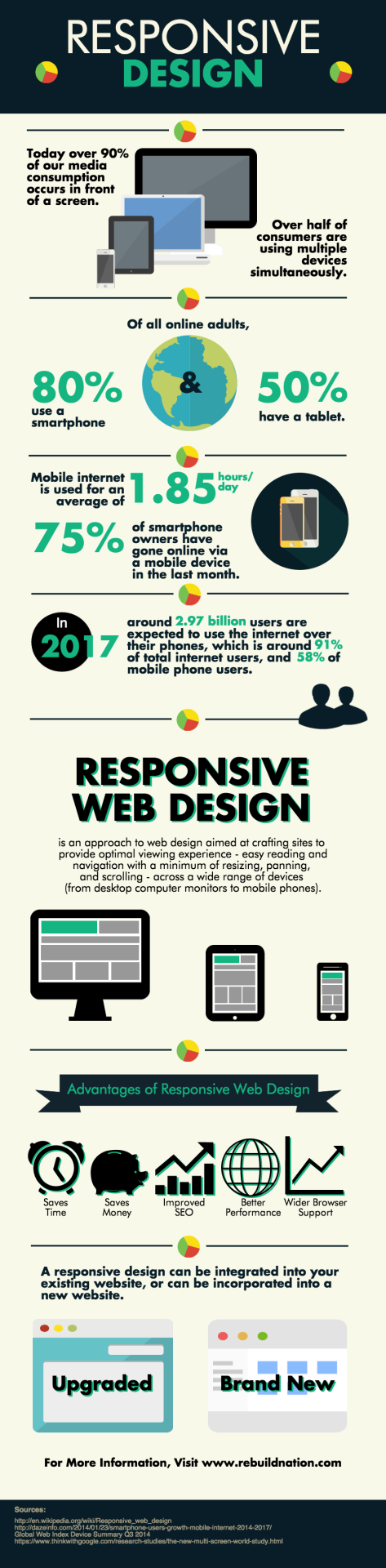
As the title – responsive design for newbies – suggests, this post is but a brief visual intro. The following infographic provides data on mobile Internet usage, predicted stats, and a straightforward definition of responsive design:
An optimal approach to web design aimed at crafting sites to provide…easy reading and navigation…across a wide range of devices.
So, if you want your blog to be an enjoyable read on a netbook, a normal-sized laptop, a tablet, a phablet, and an average mobile phone, you need responsive design.
Via Rebuild Nation
Now that you have the basics of responsive design, what’s next?
You can either look for themes that are built to be responsive without you having to code anything, or you can hire someone to do the work for you. If you’re a blogger on a limited budget, then the former option is obviously the more feasible one.