How to Choose the Best Font for Your Blog

When it comes to building a blog, we often spend time considering theme, layout, reader personas, content, plugins, and other features. However, it’s imperative that you add font to this list. While it may not appear to be a big deal, choosing one font over another can make a very big difference in how your blog is received.
5 Tips for Picking the Right Font
Before getting started, it’s important that we all understand exactly what a typeface is. While most people are familiar with scrolling through the different font selections in Microsoft Word or WordPress, many of us don’t have any understanding of typeface beyond these basic selections.
A typeface is basically a family or series of fonts that share a set of common and simple characteristics – such as shape, weight, and size. However, when you really dig into meanings behind different typefaces, you’ll realize that there’s nothing “simple” about picking the right font for your blog.
Serif vs. Sans-Serif
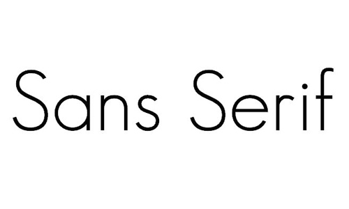
While it would be an oversimplification to say that all fonts fall into one of two categories, there are two basic overarching categories that the majority of fonts can be classified under: Serif and Sans-Serif.
“Serif fonts have little ‘feet’ or lines attached the ends of their letters. They’re generally thought to look more serious or traditional,” says graphic designer Janie Kliever. “Sans-serif literally means ‘without serif’ — these fonts don’t have the extra lines on the ends of letters. For that reason, they’re generally thought to look more modern and streamlined.”
Other basic types include script – or handwriting-style fonts – and decorative or display fonts, which typically aren’t very practical. Understanding these categories will help you as you strategize.
Aim for Consistency
Contrary to popular belief, your blog doesn’t have to select a single typeface and use it in every title, header, post, and comment. You can use multiple fonts – but make sure they are consistent with each other.
Take President Barrack Obama’s 2008 campaign for the Oval Office as an example. They turned to a well-known typeface, Gotham, for most of their campaign materials, but also chose secondary fonts like Liberation Serif and Snell Roundhand. Each had subtle differences, but they were consistent with one another.
Think About Legibility
While it seems like an obvious tip, you’d be surprised how many designers fail to consider legibility when choosing a typeface. They go with something unique and trendy, but don’t think about readability on different screens and browsers.
When it comes to legibility, think about character shapes, width, height, stroke contrast, and ascender and descended length. Unsure of what these different elements are? Check out this helpful guide.
Consider the Audience
Choosing the typeface for your blog shouldn’t be a selfish decision. In fact, it shouldn’t have anything to do with you. Instead, put the audience first and consider their preferences, needs, and desires.
Designer Igor Ovsannykov suggests asking a variety of questions, such as: “What would appeal to them the most? What’s their age bracket? Are they the fun type, or are they the serious type? Once you have this all figured out, you could finally choose the kind of font that you believe would appeal to them the most.”
Respect Your Brand
After considering the audience and their desires, come back to your brand. Do the typefaces you’ve honed in on do justice to your brand? While it’s important to keep the audience satisfied, you also have to respect your brand’s integrity with a consistent typeface that aligns with your values. Don’t overlook this step.
Ready, Set, Choose
Choosing a font should be fun and exciting. Don’t let it overwhelm you. By keeping these five tips in mind, you can approach the process in a strategic and exciting way.


Choosing a Font for the website is not an easy task, but you mentioned very nice points which should be considered while choosing fonts. Thanks for sharing, Keep it up..!!