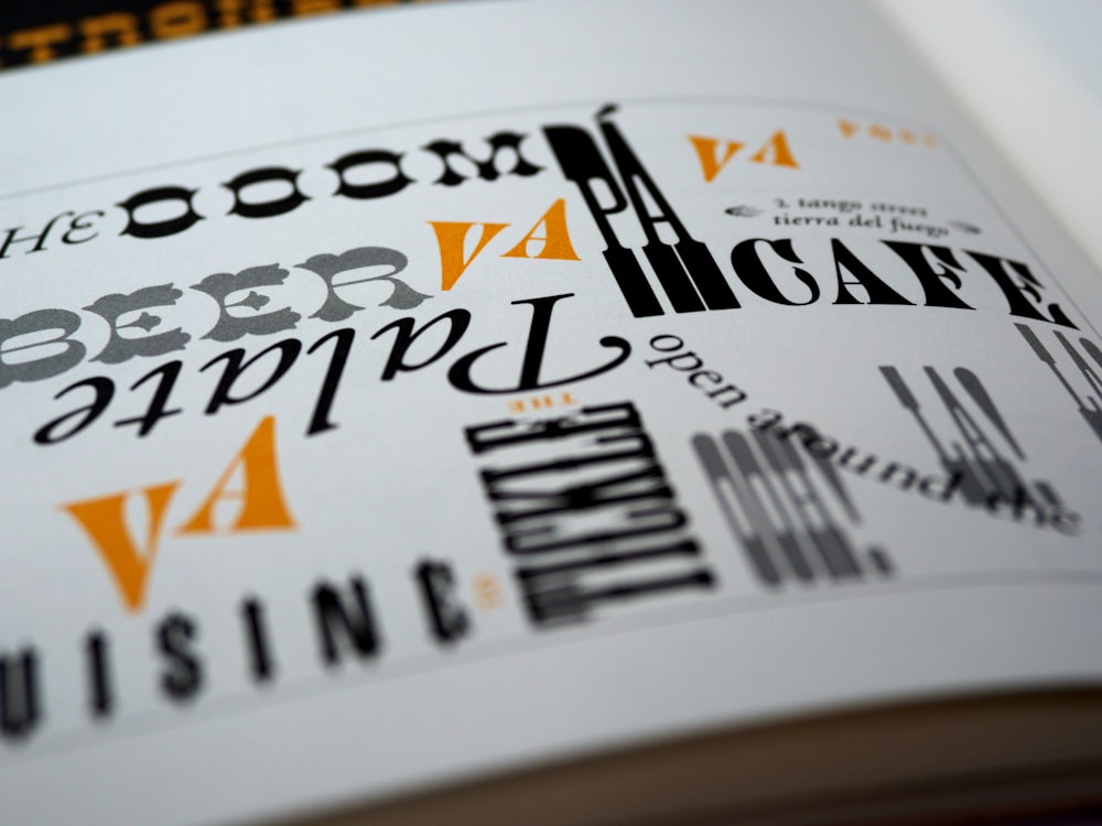
Top 14 Best Fonts on Word

Fonts are integrated with typography, a form of graphics designing and it is very important to establish the presence of your brand, product, or company and even yourself. Moreover, writing is also an integral part of our lives. And, when people think about writing, fonts come into the discussion for their utmost importance.
There are so many fonts in Microsoft Word, but not every font is suitable for all types of occasions. Rather, certain fonts are deemed professional, and on other hand, deemed casual. So, choosing a suitable font for your work is crucial.
From this article, you will get to learn about the best fonts in Word.
List of the Top 14 Best Fonts on Word
1. Helvetica
Helvetica is still the most widely used font in the world. This font is widely used by people for its use in signage and business forms such as invoices and receipts. Moreover, it is an excellent choice for customers who needs to prepare a very distinctive and clear print.
2. Calibri
Calibri was created by Microsoft and is now the default font in Microsoft Office. Its modern appearance makes it ideal for writing almost all documents related to different businesses. It is therefore considered one of the best fonts in Word.
3. Garamond
Garamond also tops this list for the best fonts on Word. This font is classic and dates back to 17th century France, and undoubtedly considered a very elegant font among such numerous fonts available. Garamond is popularly utilized by people as a book publishing typeface. For conveying a sense of refinement and a keen sense of classical taste, Garamond can be a top choice for you to use.
4. Times New Roman
Times New Roman is typically considered the world’s most well-known serif font. In 1931, the Times of London funded the creation of this font. Since they commissioned it, the Times of London has been using the typeface for a total of 40 years. As it is a standard font, Readers commonly associate this font with journalism, and publishers use it daily in the case of books and general printing. The reputation of this font makes it ideal for brands that want to project a solid, trustworthy image.
5. Futura
Sans serif fonts are popular today because they reflect the postmodern mood. Futura is the most well-known geometric font currently in use. This font is the accepted option if your customer wants readers to perceive it as ultramodern or futuristic.
6. Arial
Arial was commissioned by IBM. It’s a generally used font, similar to Helvetica. You can use this font if you want to do signage or use it in official business forms, or even complete very fine printing. It is lighter in tone and also considered less formal compared to Helvetica.
7. Cambria
Cambria was commissioned by Microsoft in the year 2004, as one of the few fonts which are closely associated with Windows Vista. It is similar to serif fonts which were prepared during the late 1800s. Moreover, like Helvetica, it has a sturdy appearance that makes it quite easy to read if written in small type. The font is primarily designed for the purpose of writing body text, and it is extensively used by typographers in typical business-related document printing.
8. Verdana
This is a font from the family of sans-serif font types. It’s also a good option for printing purposes and especially on paper. This font has a comparatively wide width and more space between characters compared to Helvetica. These characteristics make it more suitable for the purpose of fine printing.
9. Rockwell
Rockwell is an Egyptian-based font dating from the year 1910. The designer of Rockwell wanted to use the font for displays, and this is a suitable choice for using it in banners or posters. It is sufficiently big and also bold, making it suitable for purpose of signage. The font is also versatile and suitable enough to be used in standard text formats for the sole purpose of establishing brands.
10. Franklin Gothic
This font is widely used for the case of printing on billboards, even banners, and also for writing headlines. But there are many readers who also find the font too heavy for writing long passages of text. This is the font to use if your customer needs to make a statement that is considered big, or it might be bold and even used as a brief statement.
11. Cardo
Cardo includes essential typographic features like ligatures and text figures.
12. Tahoma
Tahoma comes from a long list of sans-serif fonts and the primary recipient of this font was Microsoft Corporation. It was frequently in Windows 95 that this organization decided to distribute the font. Tahoma is regularly compared with another font named Fruiter.
13. Glass Antiqua
A splendid and one-of-a-kind design that comes with a Jugenstile fleur, also with a combination of Slab Serif and Antiqua, as well as cursive calligraphy elements.
14. Kingfisher
Kingfisher is a contemporary cursive font that resembles handwriting and is ideal for invitations, labels, headings, and so on.
Font Selection Best Practices
Choosing the right font is not merely a matter of aesthetics but a critical component of effective communication. In Microsoft Word, the multitude of font options available allows for great flexibility, yet it necessitates discernment. Different types of documents demand different typographical strategies. For instance, a business report requires clarity and formality, typically achieved through traditional serif fonts like ‘Times New Roman’ or ‘Garamond.’ These fonts, with their distinct serifs and structured form, impart a sense of professionalism and readability.
Conversely, creative projects may benefit from more casual or expressive fonts such as ‘Comic Sans MS’ or ‘Bradley Hand ITC,’ which can add a personal touch or whimsical feel. However, it’s crucial to maintain legibility and ensure that the font aligns with the project’s tone and purpose.
Academic papers, on the other hand, often adhere to strict formatting guidelines, favoring standard, easily legible fonts like ‘Calibri’ or ‘Arial.’ These sans-serif fonts offer a clean, modern look, facilitating ease of reading which is paramount in academic contexts.
When selecting a font for your work in Word, consider the following guidelines to enhance the effectiveness of your document:
- Purpose: Match the font to the purpose of your document. Professional documents should lean towards classic, time-tested fonts, while more personal or informal documents can explore playful or modern styles.
- Audience: Consider the expectations and preferences of your audience. A font that appeals to a young, dynamic audience may differ significantly from one suited to a more conservative, professional demographic.
- Readability: Above all, ensure your chosen font is easy to read. Avoid overly decorative fonts for body text, as they can strain the reader’s eyes and detract from your message.
- Consistency: Use the same font throughout your document to maintain a cohesive look. If you need to use multiple fonts, limit yourself to two or three and ensure they complement each other.
- Tone: Ensure the font reinforces the tone of your writing. A serious report loses its gravitas when presented in a whimsical font, just as a light-hearted invitation may not convey the intended mood if set in a stark, rigid typeface.
By adhering to these best practices, you can harness the power of fonts to enhance your document’s clarity, impact, and professionalism. Remember, the right font does more than convey words; it sets the tone, reinforces your message, and engages your audience from the first glance.
History and Evolution of Fonts in Word
The journey of fonts within Microsoft Word is a fascinating tale of technological advancement and design trends that mirror the evolution of digital publishing and personal computing. From the early days, when choices were limited to a few system fonts, to the current plethora of typefaces available, fonts in Word have significantly influenced how we create and consume written content.
In the beginning, Microsoft Word featured a basic set of fonts, primarily focused on readability and printing capabilities. Classic fonts like Times New Roman and Courier were staples, chosen for their clarity and compatibility with early printers. These fonts set the standard for document creation, embodying the formal and professional aesthetic of the times.
As digital publishing began to take hold, the demand for more varied and expressive fonts grew. This period saw the introduction of fonts like Arial and Verdana, designed specifically for on-screen reading, marking a shift towards more user-friendly and accessible typefaces. These sans-serif fonts offered a cleaner, more modern look, aligning with the evolving design sensibilities of the digital age.
The late 1990s and early 2000s ushered in an era of customization and creativity, as Word expanded its font library to include a wider range of styles, from the elegant Garamond to the casual Comic Sans MS. This expansion was not just about variety but also about giving users the tools to express individuality and brand identity through their documents.
The introduction of OpenType fonts in the 2010s was a significant milestone, allowing for more advanced typographic features like ligatures, swashes, and stylistic sets. This development opened new creative possibilities, enabling users to achieve sophisticated design effects previously reserved for professional design software.
Today, the fonts available in Microsoft Word reflect a rich history of typographic development and an embrace of global culture, including diverse script support for languages worldwide. With cloud integration, users can now access even more fonts than ever before, ensuring that whatever the message, there is a font that can convey it with the appropriate tone and style.
In conclusion, the evolution of fonts in Microsoft Word mirrors the broader shifts in technology, design, and user needs. From functional to expressive, from standard to diverse, the history of fonts in Word is a testament to the program’s adaptability and its enduring role in our digital lives. As we look to the future, the continued innovation in typography promises to make our written communication more effective, engaging, and inclusive.
Typography Tips for Effective Document Design
Mastering the art of typography in Microsoft Word is not merely about making documents look attractive; it’s about enhancing readability, reinforcing the message, and engaging the reader. Effective use of fonts can transform a mundane document into a compelling piece of communication. Here are some essential typography tips to elevate your Word documents:
1. Pairing Fonts Wisely: A fundamental principle in typography is the art of font pairing. Combining a serif font for headings (such as Garamond) with a sans-serif font for body text (like Arial) can create a balanced and professional look. Avoid using more than two or three different fonts in a single document to maintain cohesion and prevent visual clutter.
2. Establishing Hierarchy with Font Sizes: Hierarchy helps guide the reader through the document, highlighting what’s most important. Use larger font sizes for titles and headings and smaller sizes for body text and captions. Consistency is key—establish a clear hierarchy and stick to it throughout the document.
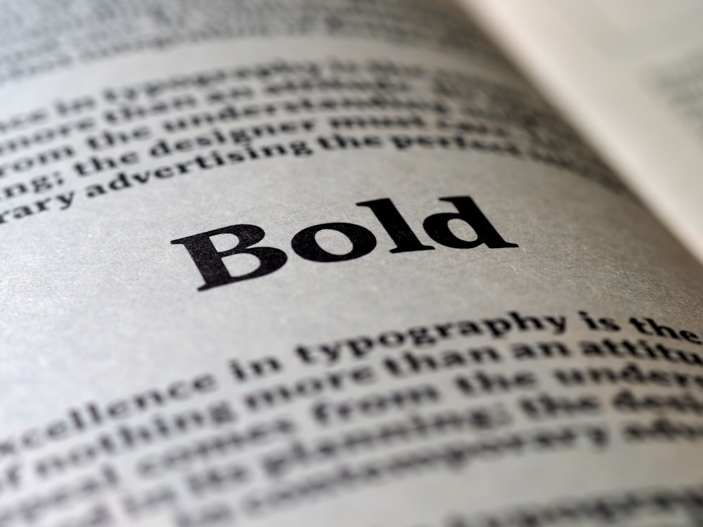
3. Utilizing Font Styles Sparingly: Bold, italics, and underline can be powerful tools for emphasis but use them sparingly. Overuse can make your document look messy and dilute their impact. Reserve bold for headings or key points, italics for quotes or references, and underline for hyperlinks only.
4. Ensuring Readability: The primary goal of your document should be readability. Choose fonts that are clear and easy to read, especially for long sections of text. Typically, a font size of 10 to 12 points is optimal for body text. Additionally, consider line spacing and paragraph spacing to improve the document’s legibility and overall appearance.
5. Color and Contrast: While most Word documents rely on black text on a white background for maximum readability, adding color can highlight important points or categorize information. However, ensure there is sufficient contrast between the text and the background to maintain readability, especially in print.

6. Consistency Across the Document: Consistency in your use of fonts, sizes, and styles throughout the document creates a cohesive and professional appearance. Develop a set of styling rules at the beginning of your document creation process and apply them uniformly.
7. Addressing the Audience: Always consider the audience and purpose of your document. A playful and informal font like Comic Sans MS may be appropriate for a party invitation but not for a business report. The choice of font should align with the message you are trying to convey and the expectations of your readers.
By incorporating these typography tips into your Word documents, you not only enhance their visual appeal but also improve their functionality and effectiveness. Typography is a powerful tool in communication—used wisely, it can significantly impact how your message is received and understood.
Conclusion
Understanding the nuances of different fonts is not just essential for designers and printing companies; it’s valuable knowledge for anyone involved in document creation or branding. By familiarizing yourself with the characteristics and appropriate uses of various fonts, you can enhance the visual appeal and effectiveness of your communications.
Each font has its unique features and connotations, making it suitable for specific contexts and industries. For example, a sleek and modern font like Calibri may be ideal for corporate reports, while a more playful font like Comic Sans MS could be appropriate for informal communications.
Moreover, the vast array of fonts available ensures that there’s always the perfect option for any project or message. Whether you’re designing a logo, crafting marketing materials, or composing a presentation, having access to a diverse selection of fonts allows you to tailor your typography to suit your needs and objectives.
In addition to the fonts mentioned in this article, there are countless others waiting to be discovered and utilized. Exploring different fonts and experimenting with their combinations can spark creativity and innovation in your design process.
Furthermore, understanding the significance of fonts goes beyond just aesthetics; it also plays a crucial role in effective communication. The right font choice can evoke certain emotions, convey professionalism, and enhance readability, ultimately influencing how your message is perceived by your audience. By mastering the art of typography, you not only showcase your attention to detail and design expertise but also ensure that your content resonates with your target audience on a deeper level. So, continue to explore, experiment, and refine your font selection skills, and unlock the full potential of typography in your creative endeavors.
Ultimately, the knowledge gained from learning about the best fonts in Word extends beyond mere technical know-how; it empowers you to make informed decisions that elevate the quality and impact of your visual communication. So, embrace the world of typography, and let your creativity flourish with the endless possibilities of fonts.
Best Fonts on Word: FAQs
What is the most beautiful font in Word?
The most beautiful font in Word can vary based on personal preference, but many users find “Calibri” and “Garamond” particularly elegant due to their clean and polished appearance.
What are the best fonts for work in Word?
For professional documents, “Times New Roman,” “Arial,” and “Calibri” are often recommended. They are widely recognized as clear, formal, and easy to read, making them suitable for work environments.
What is the best font to read in Word?
The best font for readability in Word is typically “Arial” or “Verdana.” These sans-serif fonts are designed to be clear and easy to read, even at smaller sizes.
What is the most fun font in Word?
For more casual or creative projects, “Comic Sans MS” or “Bradley Hand ITC” can add a fun and informal touch to your Word documents.
What font is most pleasing to the eye?
Many find “Georgia” to be particularly pleasing to the eye for long reads on-screen, thanks to its elegant and easy-to-read typeface.
Which font is best for the eyes?
“Arial” and “Verdana” are considered among the best fonts for the eyes, offering clear letterforms that are easy to distinguish, reducing eye strain.
How do I get cool fonts for Microsoft Word?
To get cool fonts for Microsoft Word, you can download them from reputable online font libraries like Google Fonts or DaFont. Once downloaded, install the font files on your computer, and they should appear in Word’s font list.
What is the most romantic font in Word?
“Edwardian Script ITC” and “Lucida Handwriting” are often considered romantic fonts in Word, suitable for invitations, letters, and other personal documents.
How do I use cool fonts in Word?
To use cool fonts in Word:
- Install the desired font on your computer.
- Open Microsoft Word and create or open a document.
- Highlight the text you want to change.
- Open the font drop-down menu in the “Home” tab.
- Select your new font from the list to apply it to the selected text.