Make Sure You’re On Top of Google’s Mobile-Friendly Algorithm
Are you experiencing a considerable dip in your traffic and search engine rankings? You probably know that you’re not the only one dealing with this problem. With the way Google has been tweaking its algorithm, bloggers and web site owners always have to be on their toes to continue reaching the goals they have set – or at least maintain the status quo.
One of the things that we now have to pay attention to – more than ever – is the Google mobile-friendly algorithm. You may have been getting notices about mobile issues from Webmaster Tools.
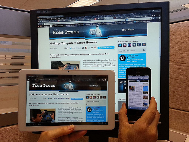
This is indicative of the importance that Google is placing on sites being absolutely mobile-friendly.
But what does that really mean?
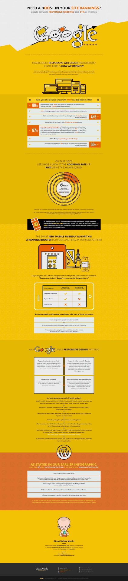
In a previous post, we had a post on the basics of responsive design: Responsive Design for Newbies [Infographic]. Does responsive design equate to mobile-friendly? Does that necessarily mean you meet Google’s requirements?
The previous infographic was meant to be a basic introduction, and now we have something more in-depth for you.

This graphic is created by WebbyMonks, and it takes you on a journey starting from responsive web design (what it is, its adoption rate, what Google thinks of it, etc.) to the new Google mobile-friendly algorithm and how you can make the necessary changes.
Don’t take this for granted. The success of your site – and potentially your earnings – may very well depend on it.