What Is Color Theory and Why Bloggers Should Know the Basics

For newbie bloggers, hearing the phrase “color theory” for the first time and why it’s important to blogging can be intimidating. But it’s simply putting colors together in a way that its visual and psychological impact on the viewer is appealing; thus, is successful and effective in sending across the message it wants to convey.
Put another way, remember a time when you came across a website, or saw a traditional billboard on a road trip, and you were drawn to it? Maybe a slogan helped. But mostly, it was the artful combination of colors that did the trick.
For you bloggers, knowing the basics of color theory is essential to your website design if you’re serious about growing your blog or increasing awareness for your product. Ancient beliefs, society and culture have imbued colors with meanings, which have been passed on to contemporary life.
When users come upon your blog, the decision to pass or read is, to a large degree, also based on your color scheme, although they may not be conscious of it. For this reason, your blog should carefully consider the colors to use for attracting traffic and setting your brand.
Along with your content, the human psyche subconsciously receives the message you are sending through the color schemes you use. It would be disastrous for your blog if you’re promoting clean water and the environment with a red logo.
Now that you get the idea, here’s a brief lesson on the basic elements of color theory:
1. The Color Wheel
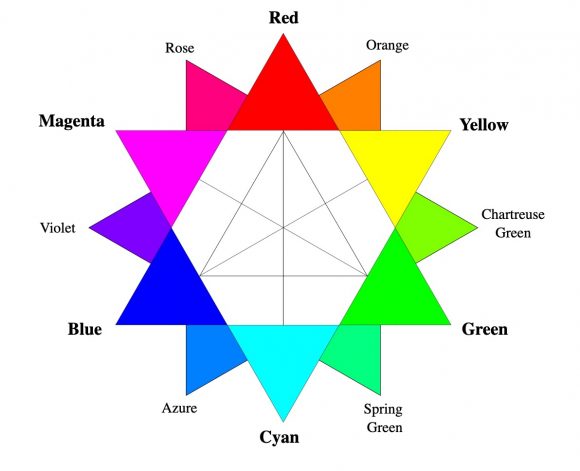
The color wheel, developed by Sir Isaac Newton, has had many variations. But basically, it is a circle with the colors in the same order, namely: red, orange, yellow, green, brown, indigo, and violet (Roy G. Biv.)
The color wheel groups colors into three classes: primary, secondary, and tertiary.
Primary colors are red, yellow and blue. These three colors come from natural pigments and cannot be re-created by mixing other colors. Mixing any two of the primary colors give you all the other colors in the color wheel.
Secondary colors are orange, green and violet. They can be made from any two primary colors mixed in equal parts. For example, red + blue = violet; yellow + blue = green; red + yellow = orange.
There are six tertiary colors, namely red-violet, red-orange, blue-green, yellow-green, blue-violet, and yellow-orange. They are made by mixing a secondary and primary color in equal parts. They are named using the primary color first and the secondary color second.
2. Color context

The color context theory presupposes that our perception of color is not absolute because it changes with the colors of its surrounding objects. A cool or warm color can seemingly change how it looks when it interacts with the color beside or around it. This is called simultaneous contrast and it becomes most intense when complementary colors are used.
3. Color scheme

Color scheme, or color harmony, is the art of putting colors together so that they go well together and are visually appealing. While color combination depends solely on the individual’s personal taste or judgment, there are still basic guidelines you can follow to come up with an artistic and tasteful design.
Here are color schemes that create color harmony:

Monochromatic scheme – made up of one color in its varying shades, hues and saturation, from darkest to lightest or vice versa. It looks great on a background of black or white but should be used sparingly as it can get boring.

Analogous colors – colors that are beside each other on the color wheel. An analogous scheme creates a feeling of consistency. One color is dominant, the second supports, and a third can be added for accent.

Complementary colors – are colors on the color wheel that are opposite each other. The strong contrast makes it stand out and adds vibrancy to the design. It’s good for highlighting but should not be used excessively as it can be jarring to the senses and straining to the eyes.
Color triads – are three colors on the color wheel that have equal distance between each other, like an equilateral triangle. When one color is dominant and the other two are used as accents, it results in a colorful yet balanced design.

Split-complementary – is made up of three colors, two being analogous, and one complementary or opposite the analogous colors in the color wheel. It yields a contrast that is less intense than a full complementary scheme and is more harmonious to the eye.

Warm colors – the reds, oranges, and yellows are warm colors. Some of their positive significance are strength, power, passion, intensity, happiness, and cheer. They are used for food, energy drinks, games, cars, sports and physical activities.

Cool colors – are the blues, greens and purples. They convey peace, calm, stability, the environment, and harmony. They are used for banks and other financial institutions, healthy living, and eco-friendly products.
